> ## Documentation Index
> Fetch the complete documentation index at: https://docs.makeswift.com/llms.txt
> Use this file to discover all available pages before exploring further.
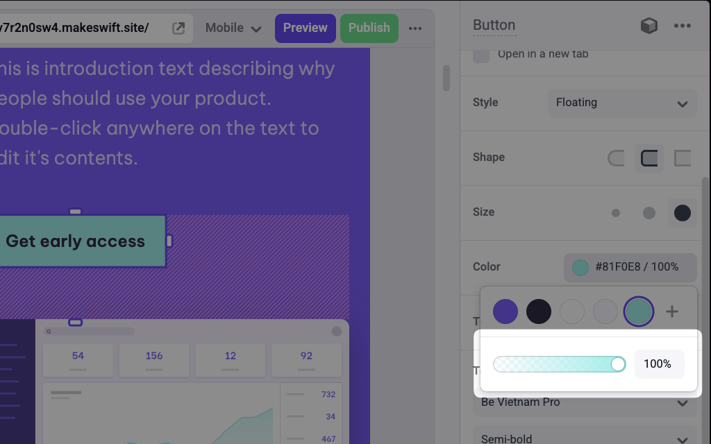
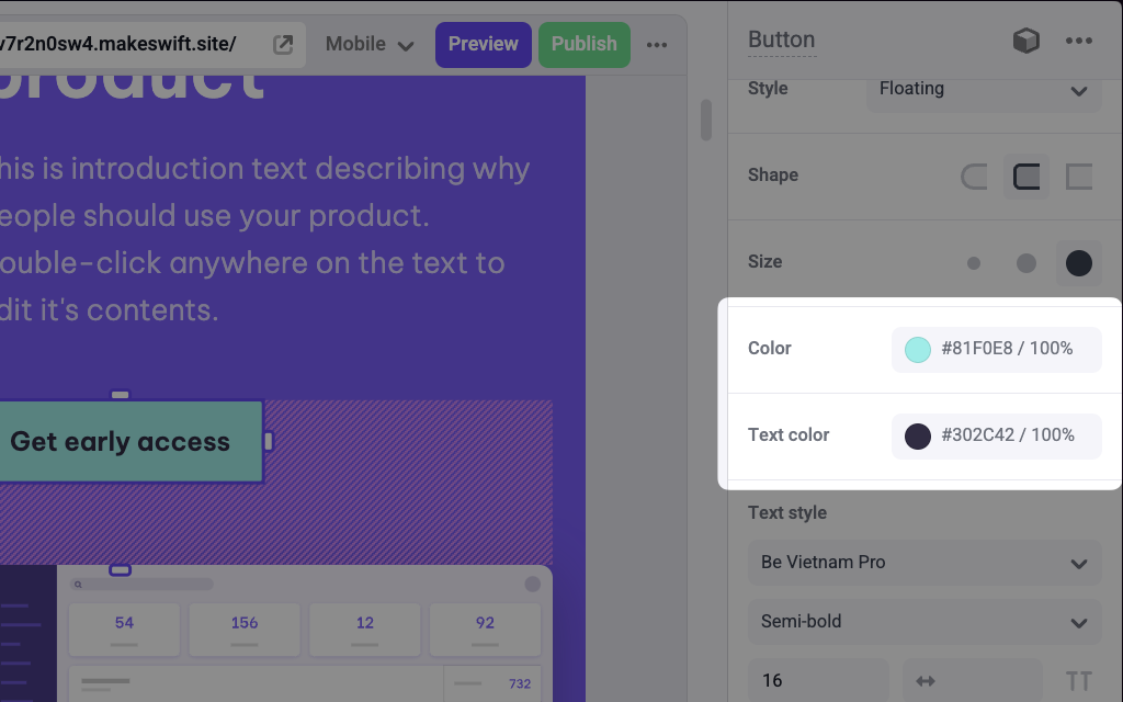
# Color
> Adds a Color picker panel in the Makeswift builder to visually edit a RGBA `string` prop.
## Params
Text for the panel label in the Makeswift builder.
The description shown in the Panel of the Makeswift builder. This can be written in Markdown format.
Added in [`v0.24.8`](https://github.com/makeswift/makeswift/releases/tag/%40makeswift%2Fruntime%400.24.8).
Position for the color label within the panel.
The value passed to your component when nothing is set in the Makeswift
builder. Must be a valid CSS color string.
Indicates whether to hide the alpha channel slider.
## Prop type
The Color control passes a `string` RGBA value to your component. If you don't set a `defaultValue` and no value is set in the builder, your component will receive `undefined`.
## Example
The following examples adds two Color controls to the `backgroundColor` and `color` props of a Button component.
### Using inline styles
```tsx Button.makeswift.ts theme={null}
import { Color } from "@makeswift/runtime/controls";
import { runtime } from "@/makeswift/runtime";
import { Button } from "./Button";
runtime.registerComponent(Button, {
type: "button",
label: "Button",
props: {
backgroundColor: Color({
label: "Background color",
defaultValue: "black",
}),
color: Color({
label: "Text color",
defaultValue: "white",
}),
},
});
```
```tsx Button.tsx theme={null}
interface Props {
backgroundColor?: string;
color?: string;
}
export function Button({ backgroundColor, color }: Props) {
return (
);
}
```
### Using CSS variables
```tsx Button.makeswift.ts theme={null}
import { Color } from "@makeswift/runtime/controls";
import { runtime } from "@/lib/makeswift/runtime";
import { Button } from "./Button";
runtime.registerComponent(Button, {
type: "button",
label: "Button",
props: {
backgroundColor: Color({
label: "Background color",
defaultValue: "black",
}),
color: Color({
label: "Text color",
defaultValue: "white",
}),
},
});
```
```tsx Button.tsx theme={null}
import { CSSProperties } from "react";
interface Props {
backgroundColor?: string;
color?: string;
}
export function Button({ backgroundColor, color }: Props) {
return (
);
}
```
`.makeswift.ts` is a naming convention for organizing Makeswift registration
code. [Learn
more](/developer/reference/runtime/register-component#organizing-registration-code).
 ## Params