> ## Documentation Index
> Fetch the complete documentation index at: https://docs.makeswift.com/llms.txt
> Use this file to discover all available pages before exploring further.
# Combobox
> Adds a Combobox panel in the Makeswift builder to visually edit a generic prop from a list of options.
 ## Params
Text for the panel label in the Makeswift builder.
The description shown in the Panel of the Makeswift builder. This can be written in Markdown format.
Added in [`v0.24.8`](https://github.com/makeswift/makeswift/releases/tag/%40makeswift%2Fruntime%400.24.8).
A function that receives a query string and returns an array of type `Option`. This function may be async to fetch options asynchronously.
```ts theme={null}
type getComboboxOptions = (
query: string
) => ComboboxOption[] | Promise[]>;
type ComboboxOption = {
id: string;
label: string;
value: T;
};
```
The `label` field is displayed in the Makeswift builder and `id` must be unique.
## Prop type
The Combobox control passes the generic type `T` from the selected `Option` to your component, or `undefined` if there is no value set in the builder.
## Example
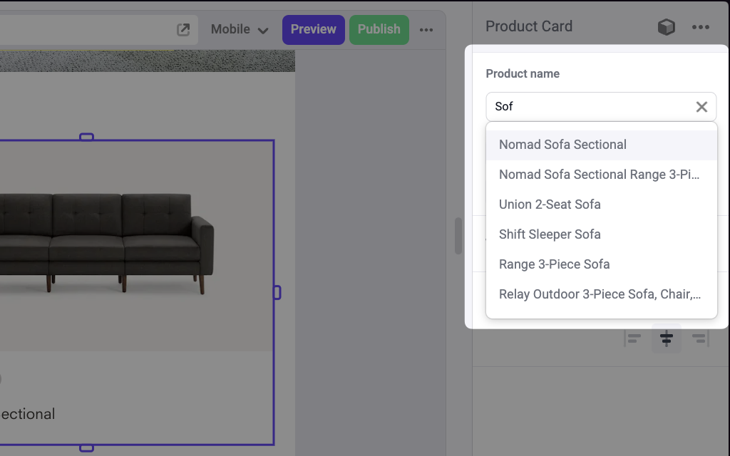
The following example adds a Combobox control to the `product` prop of a Product Card component.
```tsx ProductCard.makeswift.ts theme={null}
import { Combobox } from "@makeswift/runtime/controls";
import { fetchProducts } from "@/lib/fetchers";
import { runtime } from "@/makeswift/runtime";
import { ProductCard } from "./ProductCard";
runtime.registerComponent(ProductCard, {
type: "product-card",
label: "Product Card",
props: {
product: Combobox({
label: "Product name",
async getOptions(query) {
const products = await fetchProducts();
return products
.map((product) => ({
id: product.id,
label: product.name,
value: product,
}))
.filter((option) =>
option.label.toLowerCase().includes(query.toLowerCase())
);
},
}),
},
});
```
```tsx ProductCard.tsx theme={null}
interface Product {
id: string
name: string
price: number
image: string
}
interface Props {
product?: Product
}
const defaultProduct = {
id: "1",
name: "Default product",
price: 100,
image: "https://via.placeholder.com/150",
}
export function ProductsCarousel({ product = defaultProduct }: Props) {
return (
## Params
Text for the panel label in the Makeswift builder.
The description shown in the Panel of the Makeswift builder. This can be written in Markdown format.
Added in [`v0.24.8`](https://github.com/makeswift/makeswift/releases/tag/%40makeswift%2Fruntime%400.24.8).
A function that receives a query string and returns an array of type `Option`. This function may be async to fetch options asynchronously.
```ts theme={null}
type getComboboxOptions = (
query: string
) => ComboboxOption[] | Promise[]>;
type ComboboxOption = {
id: string;
label: string;
value: T;
};
```
The `label` field is displayed in the Makeswift builder and `id` must be unique.
## Prop type
The Combobox control passes the generic type `T` from the selected `Option` to your component, or `undefined` if there is no value set in the builder.
## Example
The following example adds a Combobox control to the `product` prop of a Product Card component.
```tsx ProductCard.makeswift.ts theme={null}
import { Combobox } from "@makeswift/runtime/controls";
import { fetchProducts } from "@/lib/fetchers";
import { runtime } from "@/makeswift/runtime";
import { ProductCard } from "./ProductCard";
runtime.registerComponent(ProductCard, {
type: "product-card",
label: "Product Card",
props: {
product: Combobox({
label: "Product name",
async getOptions(query) {
const products = await fetchProducts();
return products
.map((product) => ({
id: product.id,
label: product.name,
value: product,
}))
.filter((option) =>
option.label.toLowerCase().includes(query.toLowerCase())
);
},
}),
},
});
```
```tsx ProductCard.tsx theme={null}
interface Product {
id: string
name: string
price: number
image: string
}
interface Props {
product?: Product
}
const defaultProduct = {
id: "1",
name: "Default product",
price: 100,
image: "https://via.placeholder.com/150",
}
export function ProductsCarousel({ product = defaultProduct }: Props) {
return (

{product.name}
{product.price}
)
}
```
`.makeswift.ts` is a naming convention for organizing Makeswift registration
code. [Learn
more](/developer/reference/runtime/register-component#organizing-registration-code).