> ## Documentation Index
> Fetch the complete documentation index at: https://docs.makeswift.com/llms.txt
> Use this file to discover all available pages before exploring further.
# Group
> The `Group` control allows you to define and visually edit a group of properties and replaces the deprecated [Shape](/developer/reference/controls/shape) control.
 ## Params
Text for the panel label in the Makeswift Visual Builder.
The description shown in the Panel of the Makeswift builder. This can be written in Markdown format.
Added in [`v0.24.8`](https://github.com/makeswift/makeswift/releases/tag/%40makeswift%2Fruntime%400.24.8).
## Params
Text for the panel label in the Makeswift Visual Builder.
The description shown in the Panel of the Makeswift builder. This can be written in Markdown format.
Added in [`v0.24.8`](https://github.com/makeswift/makeswift/releases/tag/%40makeswift%2Fruntime%400.24.8).
The preferred layout for the group in the Makeswift Visual Builder. Note that the builder may override this preference to optimize the user experience. Possible values include:
- `Group.Layout.Inline`: Renders the group properties within the parent panel, visually grouping them to reflect the hierarchy. This is the default if no explicit value is provided.
- `Group.Layout.Popover`: Renders the group properties in a standalone popover panel.
An object mapping of prop names to Makeswift
[controls](/developer/concepts#controls) representing the properties being
grouped. This can include any of the Makeswift controls, including other
groups.
## Prop type
The `Group` control passes an `object` based on the controls defined in the `props` field. The keys of the object match the keys in the `props` field, and the values are based on the corresponding control's prop type.
## Example
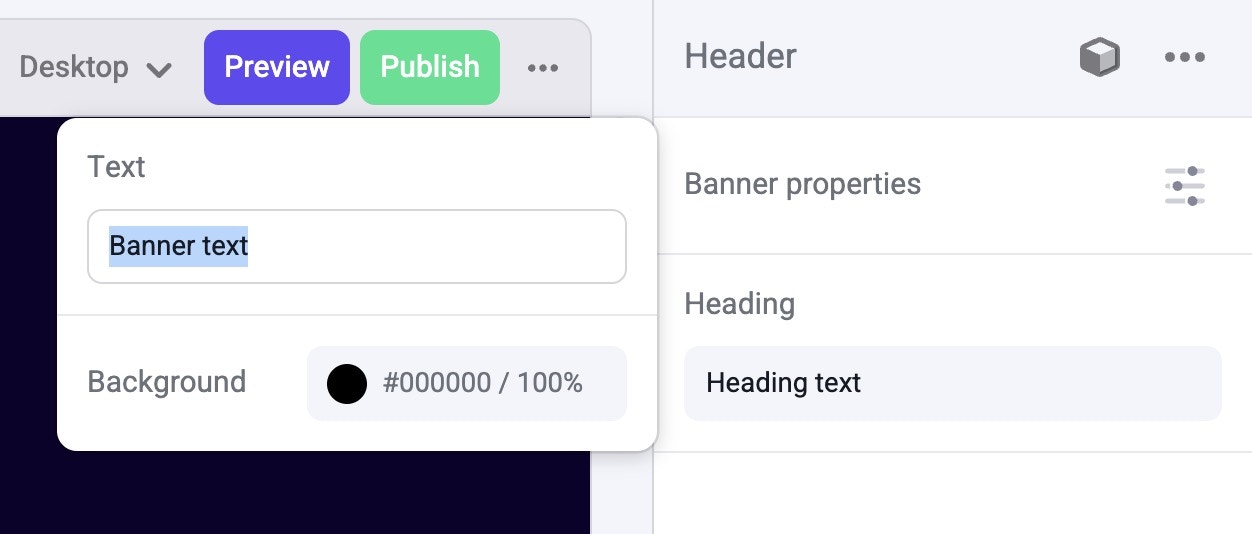
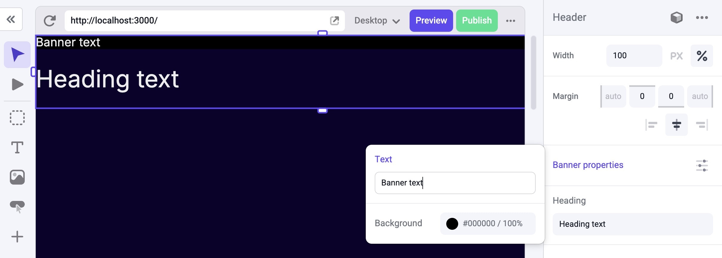
This example adds a `Group` control to represent the properties of a banner within a Header component.
 ```tsx Header.makeswift.ts theme={null}
import { Group, Color, TextInput, Style } from "@makeswift/runtime/controls";
import { runtime } from "@/makeswift/runtime";
import { Header } from "./Header";
runtime.registerComponent(Header, {
type: "header",
label: "Header",
props: {
className: Style(),
banner: Group({
label: "Banner properties",
preferredLayout: Group.Layout.Popover,
props: {
text: TextInput({ defaultValue: "Banner text" }),
background: Color({ label: "Background", defaultValue: "black" }),
},
}),
heading: TextInput({ label: "Heading", defaultValue: "Heading text" }),
},
});
```
```tsx Header.tsx theme={null}
interface HeaderProps {
banner: {
text: string;
background: string;
};
heading: string;
className: string;
}
export function Header({ banner, heading, className }: HeaderProps) {
return (
);
}
```
`.makeswift.ts` is a naming convention for organizing Makeswift registration
code. [Learn
more](/developer/reference/runtime/register-component#organizing-registration-code).
```tsx Header.makeswift.ts theme={null}
import { Group, Color, TextInput, Style } from "@makeswift/runtime/controls";
import { runtime } from "@/makeswift/runtime";
import { Header } from "./Header";
runtime.registerComponent(Header, {
type: "header",
label: "Header",
props: {
className: Style(),
banner: Group({
label: "Banner properties",
preferredLayout: Group.Layout.Popover,
props: {
text: TextInput({ defaultValue: "Banner text" }),
background: Color({ label: "Background", defaultValue: "black" }),
},
}),
heading: TextInput({ label: "Heading", defaultValue: "Heading text" }),
},
});
```
```tsx Header.tsx theme={null}
interface HeaderProps {
banner: {
text: string;
background: string;
};
heading: string;
className: string;
}
export function Header({ banner, heading, className }: HeaderProps) {
return (
);
}
```
`.makeswift.ts` is a naming convention for organizing Makeswift registration
code. [Learn
more](/developer/reference/runtime/register-component#organizing-registration-code).