> ## Documentation Index
> Fetch the complete documentation index at: https://docs.makeswift.com/llms.txt
> Use this file to discover all available pages before exploring further.
# Select
> Adds a Select option (dropdown) to a component in the Makeswift builder to visually select a `string` value.
 ## Params
Text for the panel label in the Makeswift builder.
The description shown in the Panel of the Makeswift builder. This can be written in Markdown format.
Added in [`v0.24.8`](https://github.com/makeswift/makeswift/releases/tag/%40makeswift%2Fruntime%400.24.8).
Orientation of the dropdown label within the panel.
An array of objects of type `SelectOption` that contains the options available in the panel input.
```ts theme={null}
type SelectOption = {
value: T;
label: string;
};
```
The `label` field is displayed in the Makeswift builder.
The value passed to your component when nothing is set in the Makeswift
builder.
## Prop type
The Select control passes the generic type `T` from the selected `Option` to your component. If you don't set a `defaultValue` and no value is set in the builder, your component will receive `undefined`.
## Example
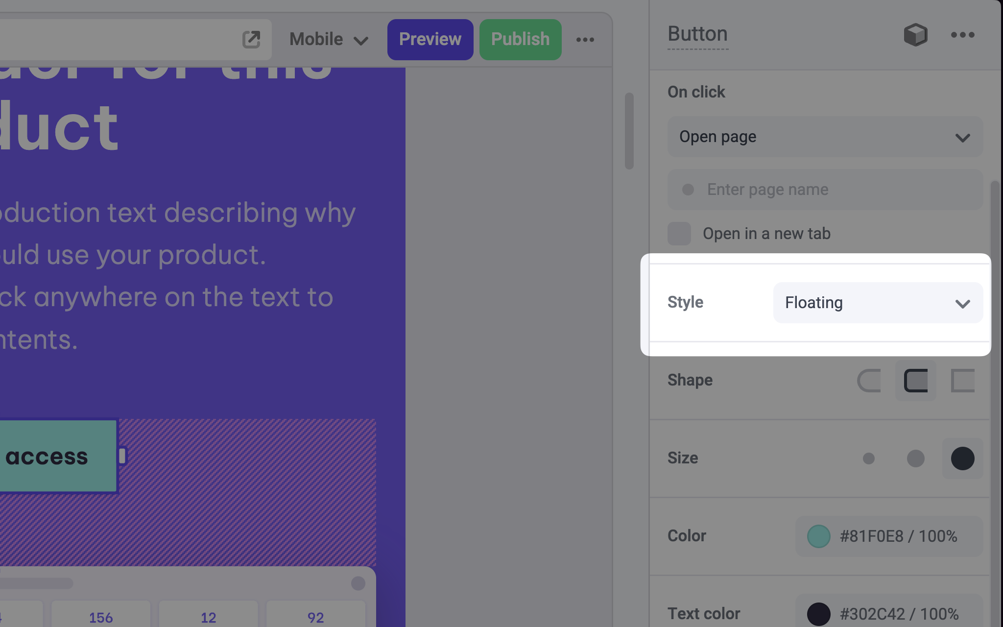
The following example adds a Select control to the `variant` prop of a Button component.
```tsx Button.makeswift.ts theme={null}
import { Select } from "@makeswift/runtime/controls";
import { runtime } from "@/makeswift/runtime";
import { Button } from "./Button";
runtime.registerComponent(Button, {
type: "button",
label: "Button",
props: {
variant: Select({
label: "Style",
labelOrientation: "horizontal",
options: [
{ value: "floating", label: "Floating" },
{ value: "outline", label: "Outline" },
{ value: "clear", label: "Clear" },
],
defaultValue: "floating",
}),
},
});
```
```tsx Button.tsx theme={null}
import clsx from "clsx";
interface Props {
variant?: "floating" | "outline" | "clear";
}
export function Button({ variant = "floating" }: Props) {
return (
Click me
);
}
```
`.makeswift.ts` is a naming convention for organizing Makeswift registration
code. [Learn
more](/developer/reference/runtime/register-component#organizing-registration-code).
## Params
Text for the panel label in the Makeswift builder.
The description shown in the Panel of the Makeswift builder. This can be written in Markdown format.
Added in [`v0.24.8`](https://github.com/makeswift/makeswift/releases/tag/%40makeswift%2Fruntime%400.24.8).
Orientation of the dropdown label within the panel.
An array of objects of type `SelectOption` that contains the options available in the panel input.
```ts theme={null}
type SelectOption = {
value: T;
label: string;
};
```
The `label` field is displayed in the Makeswift builder.
The value passed to your component when nothing is set in the Makeswift
builder.
## Prop type
The Select control passes the generic type `T` from the selected `Option` to your component. If you don't set a `defaultValue` and no value is set in the builder, your component will receive `undefined`.
## Example
The following example adds a Select control to the `variant` prop of a Button component.
```tsx Button.makeswift.ts theme={null}
import { Select } from "@makeswift/runtime/controls";
import { runtime } from "@/makeswift/runtime";
import { Button } from "./Button";
runtime.registerComponent(Button, {
type: "button",
label: "Button",
props: {
variant: Select({
label: "Style",
labelOrientation: "horizontal",
options: [
{ value: "floating", label: "Floating" },
{ value: "outline", label: "Outline" },
{ value: "clear", label: "Clear" },
],
defaultValue: "floating",
}),
},
});
```
```tsx Button.tsx theme={null}
import clsx from "clsx";
interface Props {
variant?: "floating" | "outline" | "clear";
}
export function Button({ variant = "floating" }: Props) {
return (
Click me
);
}
```
`.makeswift.ts` is a naming convention for organizing Makeswift registration
code. [Learn
more](/developer/reference/runtime/register-component#organizing-registration-code).