> ## Documentation Index
> Fetch the complete documentation index at: https://docs.makeswift.com/llms.txt
> Use this file to discover all available pages before exploring further.
# Slot
> Add a Slot in the Makeswift builder to visually drop in a `ReactNode`.
 ## Params
The Slot control currently doesn't take any parameters.
## Prop type
The Slot control passes a `ReactNode` to your component.
## Example
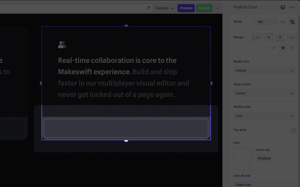
The following example adds a Slot control to the `media` prop of a Feature Card component.
```tsx FeatureCard.makeswift.ts theme={null}
import { Slot, TextInput, Image } from "@makeswift/runtime/controls"
import { runtime } from "@/makeswift/runtime"
import { FeatureCard } from "./FeatureCard"
runtime.registerComponent(FeatureCard, {
type: "feature-card",
label: "Feature Card",
props: {
icon: Image({ label: "Icon" }),
headline: TextInput({ label: "Headline" }),
body: TextInput({ label: "Body" }),
media: Slot(),
},
})
```
```tsx FeatureCard.tsx theme={null}
interface Props {
icon?: string
headline?: string
body?: string
media: ReactNode
}
export function FeatureCard({ icon, headline, body, media }: Props) {
return (
## Params
The Slot control currently doesn't take any parameters.
## Prop type
The Slot control passes a `ReactNode` to your component.
## Example
The following example adds a Slot control to the `media` prop of a Feature Card component.
```tsx FeatureCard.makeswift.ts theme={null}
import { Slot, TextInput, Image } from "@makeswift/runtime/controls"
import { runtime } from "@/makeswift/runtime"
import { FeatureCard } from "./FeatureCard"
runtime.registerComponent(FeatureCard, {
type: "feature-card",
label: "Feature Card",
props: {
icon: Image({ label: "Icon" }),
headline: TextInput({ label: "Headline" }),
body: TextInput({ label: "Body" }),
media: Slot(),
},
})
```
```tsx FeatureCard.tsx theme={null}
interface Props {
icon?: string
headline?: string
body?: string
media: ReactNode
}
export function FeatureCard({ icon, headline, body, media }: Props) {
return (

{headline}
{body}
{media}
)
}
```
`.makeswift.ts` is a naming convention for organizing Makeswift registration
code. [Learn
more](/developer/reference/runtime/register-component#organizing-registration-code).