> ## Documentation Index
> Fetch the complete documentation index at: https://docs.makeswift.com/llms.txt
> Use this file to discover all available pages before exploring further.
# Align items
> Align items controls the vertical alignment of elements within a box. It ensures that elements are properly aligned, whether at the top, middle, or bottom, providing a balanced and aesthetically pleasing layout.
When you place other elements in a box you can determine how the elements will be aligned with respect to one another using the “Align items” panel. By default, all content will align at the top of a box. Content can also be aligned in the middle or anchored to the bottom. A fourth option of “space between” lets you space the box's content apart at equal distances.
 Horizontal alignment exists in Makeswift within the
[margin](/product/component/property-controls/margin) panel.
## Top
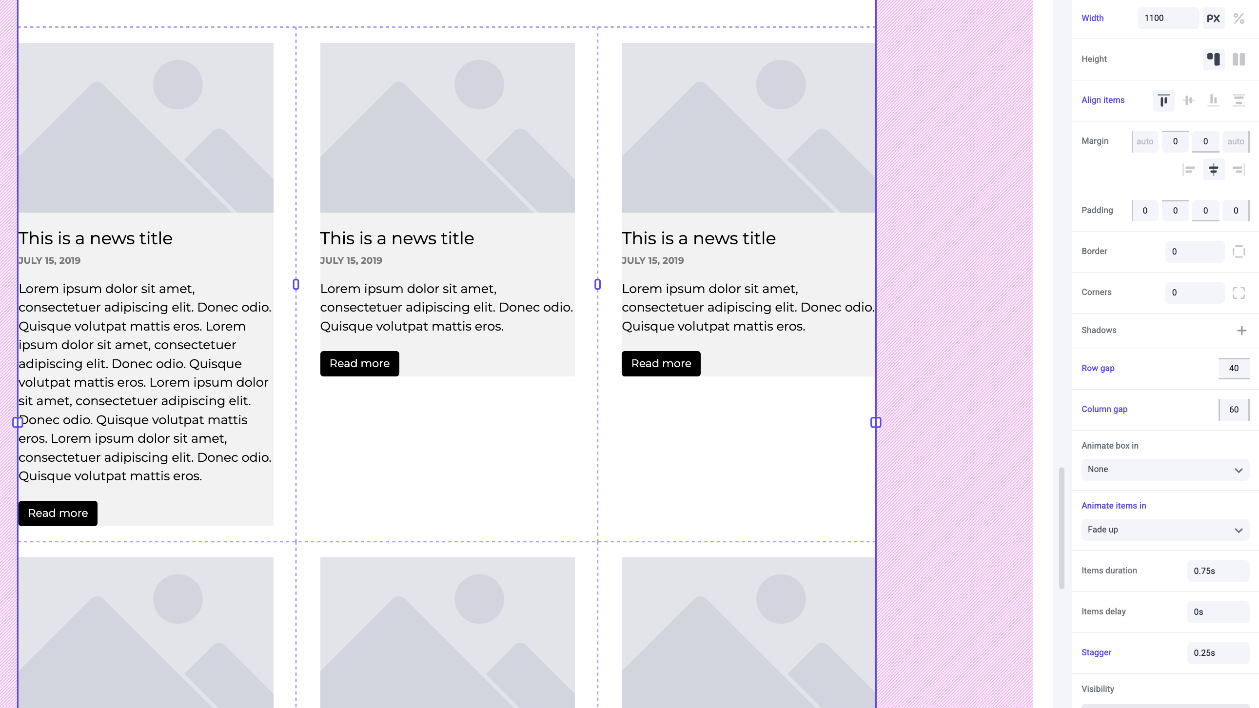
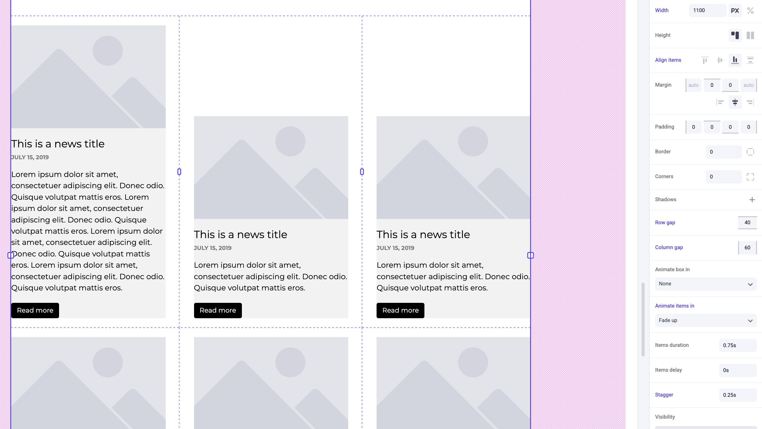
By default items will align to the top of a box. Typically you will use this if all of your contents have a similar height, or if you want specific content like your images to be in line across all of your elements in a row.
Horizontal alignment exists in Makeswift within the
[margin](/product/component/property-controls/margin) panel.
## Top
By default items will align to the top of a box. Typically you will use this if all of your contents have a similar height, or if you want specific content like your images to be in line across all of your elements in a row.
 ## Middle
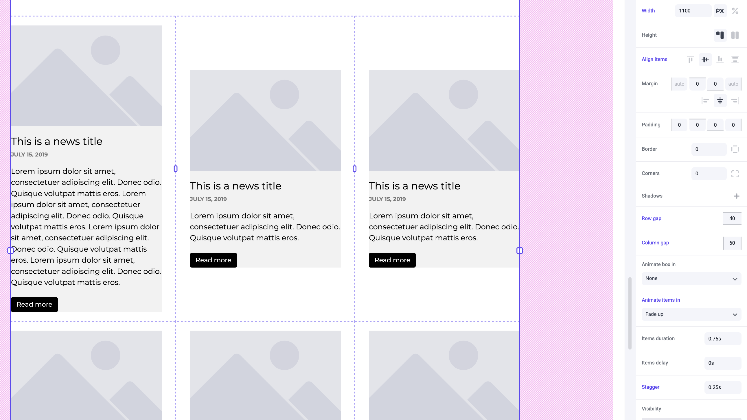
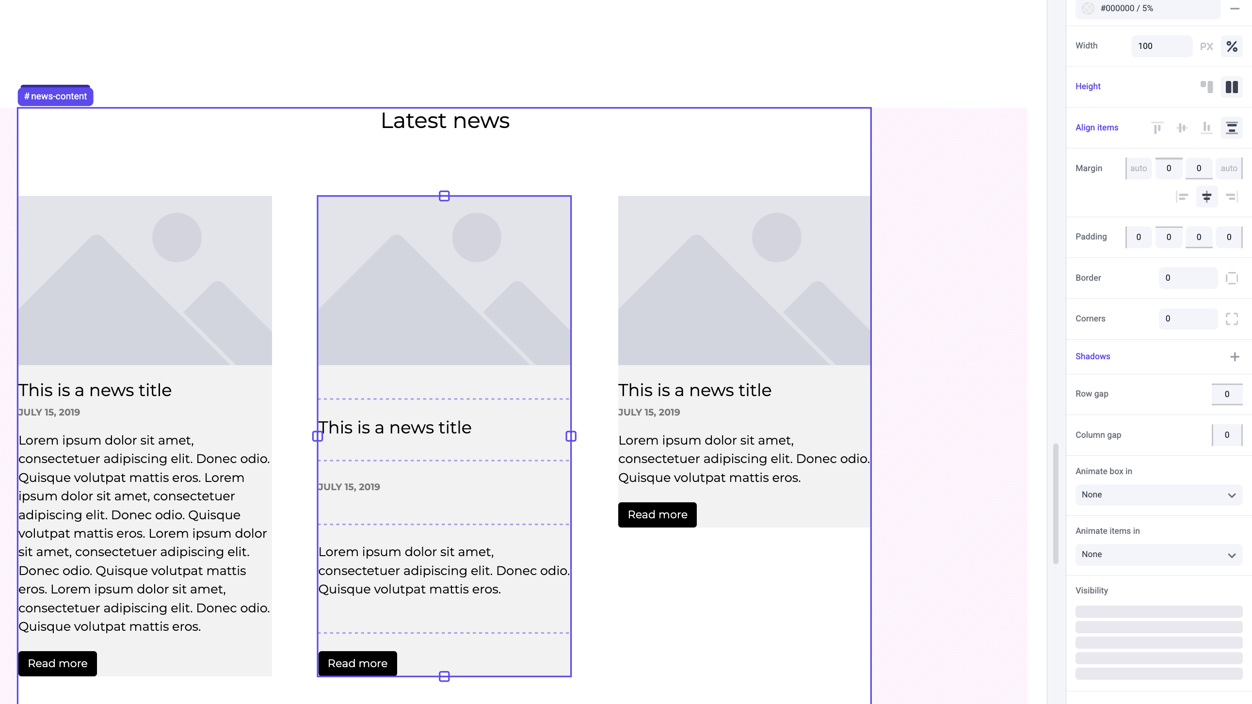
Middle is a great way to center your elements with respect to one another, even if they differ in height.
## Middle
Middle is a great way to center your elements with respect to one another, even if they differ in height.
 ## Bottom
Bottom is similar to top and is used in situations where you may want specific content like a button to be in line across all of your elements in a row.
## Bottom
Bottom is similar to top and is used in situations where you may want specific content like a button to be in line across all of your elements in a row.
 ## Space between
Space between will set a box's content to be completely spread out at equal distances between them. If you want images to be in line at the top but a button to be in line at the bottom, this is a good alignment to use.
## Space between
Space between will set a box's content to be completely spread out at equal distances between them. If you want images to be in line at the top but a button to be in line at the bottom, this is a good alignment to use.
 Space between only takes effect if the box
[height](/product/component/property-controls/height) is set to stretch and
there is extra space created within the box.
## Examples
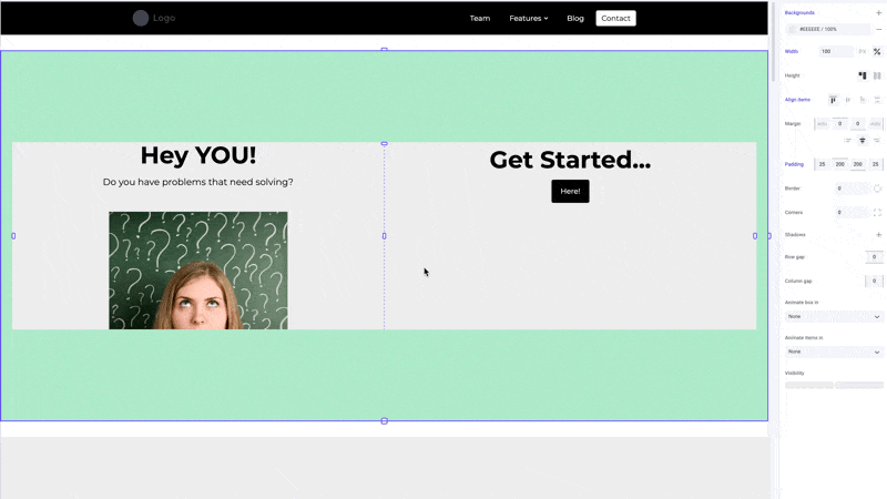
For a hero section it is typical to use middle alignment.
Space between only takes effect if the box
[height](/product/component/property-controls/height) is set to stretch and
there is extra space created within the box.
## Examples
For a hero section it is typical to use middle alignment.
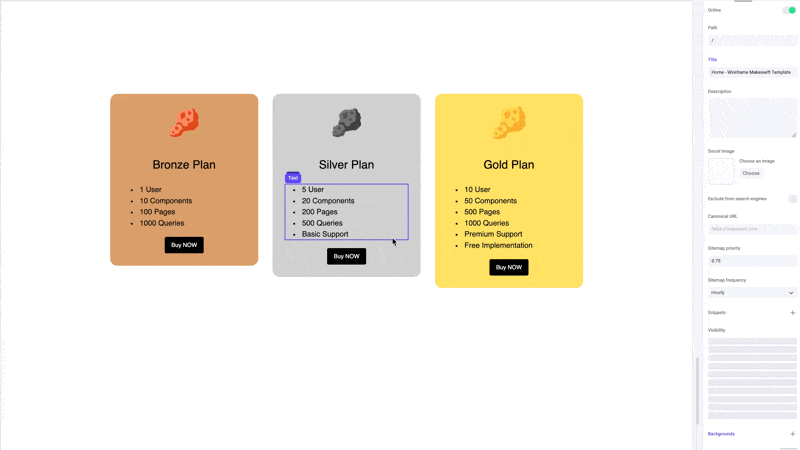
 In order to properly align elements at the bottom of components, like pricing cards, you'll want to use space between.