> ## Documentation Index
> Fetch the complete documentation index at: https://docs.makeswift.com/llms.txt
> Use this file to discover all available pages before exploring further.
# Layouts
> Layout refers to the composition of your page. Pages are in and of themselves components containing other components. The Makeswift builder gives you controls to organize and navigate layouts easily.
## Creating a layout using a Box
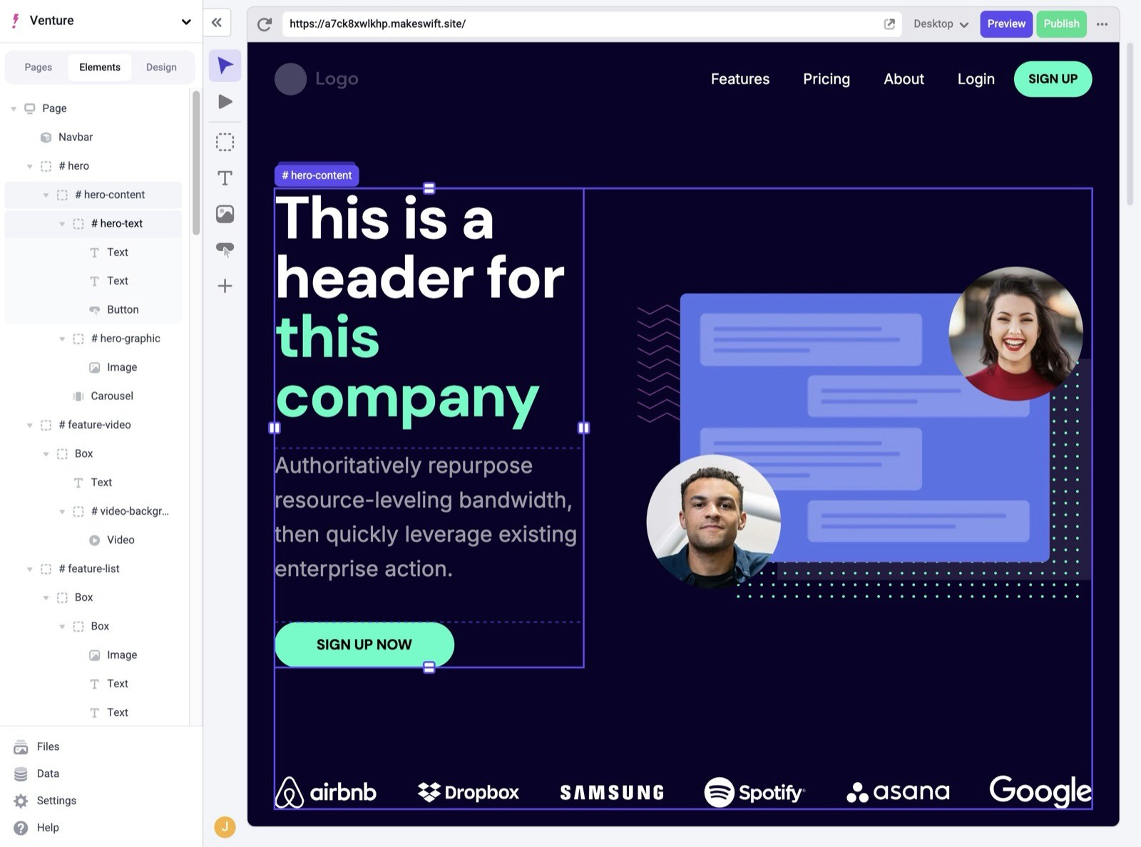
You can create a new layout by clicking the [Box](/product/components#box) component in the toolbar, then clicking to add it onto your page. You can add any number of [Components](/product/components) into a Box, including other Boxes. Components can be placed side-by-side to create columns or placed above and below to create new rows.
> Shortcut: Use the `x` key to select the Box tool. Then, click on the page where you want to add it.
 When creating a multi-column layout, where each column has multiple components, you’ll most likely want to wrap each column in a Box. This way you can move columns easily and keep all the components together when creating [breakpoints](/product/responsive-design) for mobile devices.
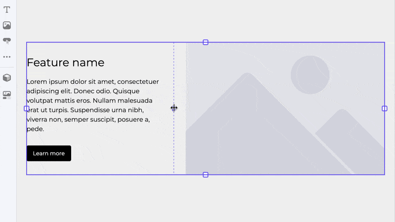
## 12-column grid
Boxes use a 12-column grid to allow for precise and flexible layout design. You can easily span components across multiple columns or align them within a single column, creating balanced and visually appealing designs. To adjust, simply click and hold the handle in the center of the dashed column line and drag.
When creating a multi-column layout, where each column has multiple components, you’ll most likely want to wrap each column in a Box. This way you can move columns easily and keep all the components together when creating [breakpoints](/product/responsive-design) for mobile devices.
## 12-column grid
Boxes use a 12-column grid to allow for precise and flexible layout design. You can easily span components across multiple columns or align them within a single column, creating balanced and visually appealing designs. To adjust, simply click and hold the handle in the center of the dashed column line and drag.
 ## Selecting components
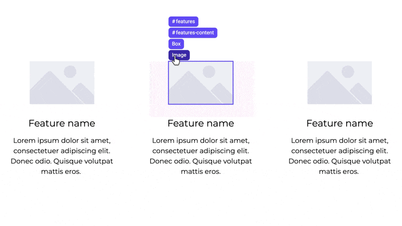
If you have a lot of nested content on your page, it can be difficult to find and click on a specific components. Breadcrumbs are designed to help you understand your page structure and make it easier to select and move your Boxes. To get to the breadcrumbs, hover over a component within the desired Box. Move your cursor to the label found at the top left of the component and it's breadcrumbs will open.
You can hover over each breadcrumb to see its corresponding Box. Click once on any breadcrumb in the list to select it. You can also click and hold a breadcrumb to drag and drop the highlighted box somewhere else.
## Selecting components
If you have a lot of nested content on your page, it can be difficult to find and click on a specific components. Breadcrumbs are designed to help you understand your page structure and make it easier to select and move your Boxes. To get to the breadcrumbs, hover over a component within the desired Box. Move your cursor to the label found at the top left of the component and it's breadcrumbs will open.
You can hover over each breadcrumb to see its corresponding Box. Click once on any breadcrumb in the list to select it. You can also click and hold a breadcrumb to drag and drop the highlighted box somewhere else.
 In addition to Breadcrumbs, you can use the [Elements Panel](/product/builder-basics#elements-panel) to easily view and select individual components from your page.