> ## Documentation Index
> Fetch the complete documentation index at: https://docs.makeswift.com/llms.txt
> Use this file to discover all available pages before exploring further.
# Component basics
> Learn how to use and customize components in Makeswift.
Spend a few seconds exploring the Canvas and its components. You can click on any component in the Canvas to see its corresponding properties in the Properties Sidebar.
## Selecting components
To better understand the structure of different layouts, you can use [Breadcrumbs](/product/layouts#selecting-components) which allow finer granularity on navigating and selecting components. To activate Breadcrumbs, hover over the label of a component and you'll see a list of its ancestors.
You can also use the [Elements Panel](/product/builder-basics#elements-panel) to easily view and select individual components from your page.
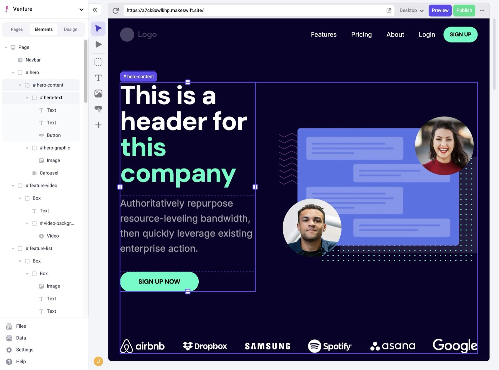 ## Customizing the hero
Now that you understand the basic layout of components, let's start to make some changes. Click once on the Text component that says **This is a header for this company** to select it. You can also double click the component to update its text inline.
Update that text to say **Welcome to Makeswift**.
There are several built-in components in Makeswift including
[Box](/product/components#box), [Text](/product/components#text),
[Image](/product/components#image), and several more. For full reference,
check out the [Component docs](/product/components).
Notice that you've lost the green accent color in the text. To fix this, select the text **Makeswift**. In the Properties Sidebar, under the **Text style** panel, click the color picker. Then, choose the green accent color.
There are various properties you can change for each selected component. For example, with Text components, you can change font size, weight, color, and more. You can also save these settings to be reused in your site. You'll learn more about this in the next section.
## In the next section...
You'll learn how to customize colors and text styles to define your site's look and feel.
## Customizing the hero
Now that you understand the basic layout of components, let's start to make some changes. Click once on the Text component that says **This is a header for this company** to select it. You can also double click the component to update its text inline.
Update that text to say **Welcome to Makeswift**.
There are several built-in components in Makeswift including
[Box](/product/components#box), [Text](/product/components#text),
[Image](/product/components#image), and several more. For full reference,
check out the [Component docs](/product/components).
Notice that you've lost the green accent color in the text. To fix this, select the text **Makeswift**. In the Properties Sidebar, under the **Text style** panel, click the color picker. Then, choose the green accent color.
There are various properties you can change for each selected component. For example, with Text components, you can change font size, weight, color, and more. You can also save these settings to be reused in your site. You'll learn more about this in the next section.
## In the next section...
You'll learn how to customize colors and text styles to define your site's look and feel.