Props
-
MakeswiftComponentSnapshotrequiredThe Makeswift snapshot to render.
-
stringrequiredThe label of the component used in the Visual Builder.
-
stringrequiredThe type of the registered Makeswift component. This should match the
typeproperty that was used when calling registerComponent.
Example
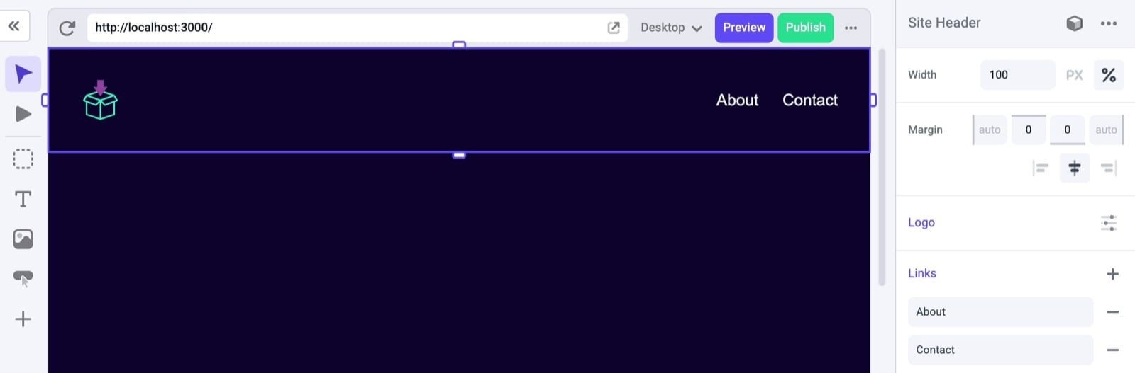
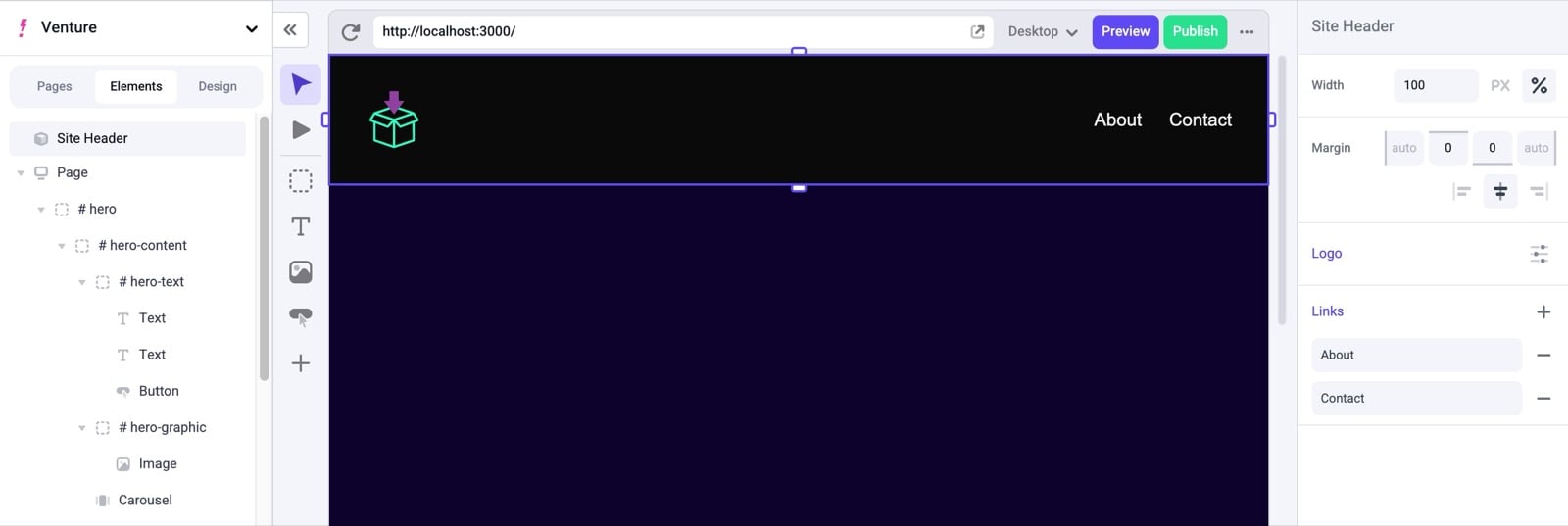
The following example registers a<Header> component that is editable by the user and will be displayed on each page.
Creating the component
First, you’ll need a React component. Here, we’re going to create one that takes three properties:className, logo, and links.
@/components/header/index.tsx
Registering with Makeswift
Next, this component needs to be registered with Makeswift. This example registers the same three properties:className, logo, and links. Notice these property names match the property names defined in the Header component.
In
registerComponent the hidden property is set to true which hides it
from being listed in the Component Tray. This is because we will be
hard-coding where this component will be incorporated into the page and we
don’t want the user to drag and drop multiple instances of it.@/components/header/register.ts
makeswift/components.ts file with the rest of your components. If you don’t already have this file, refer to the App Router Installation guide to ensure it’s created and imported in the correct places.
Rendering the component
Then, you’ll need to retrieve the snapshot of the component from the Makeswift API by callinggetComponentSnapshot with a unique ID and pass that snapshot to <MakeswiftComponent>.
Here, we are adding the <Header> to the root layout.tsx file so that it shows up on each page.
@/app/layout.tsx
Adding a description
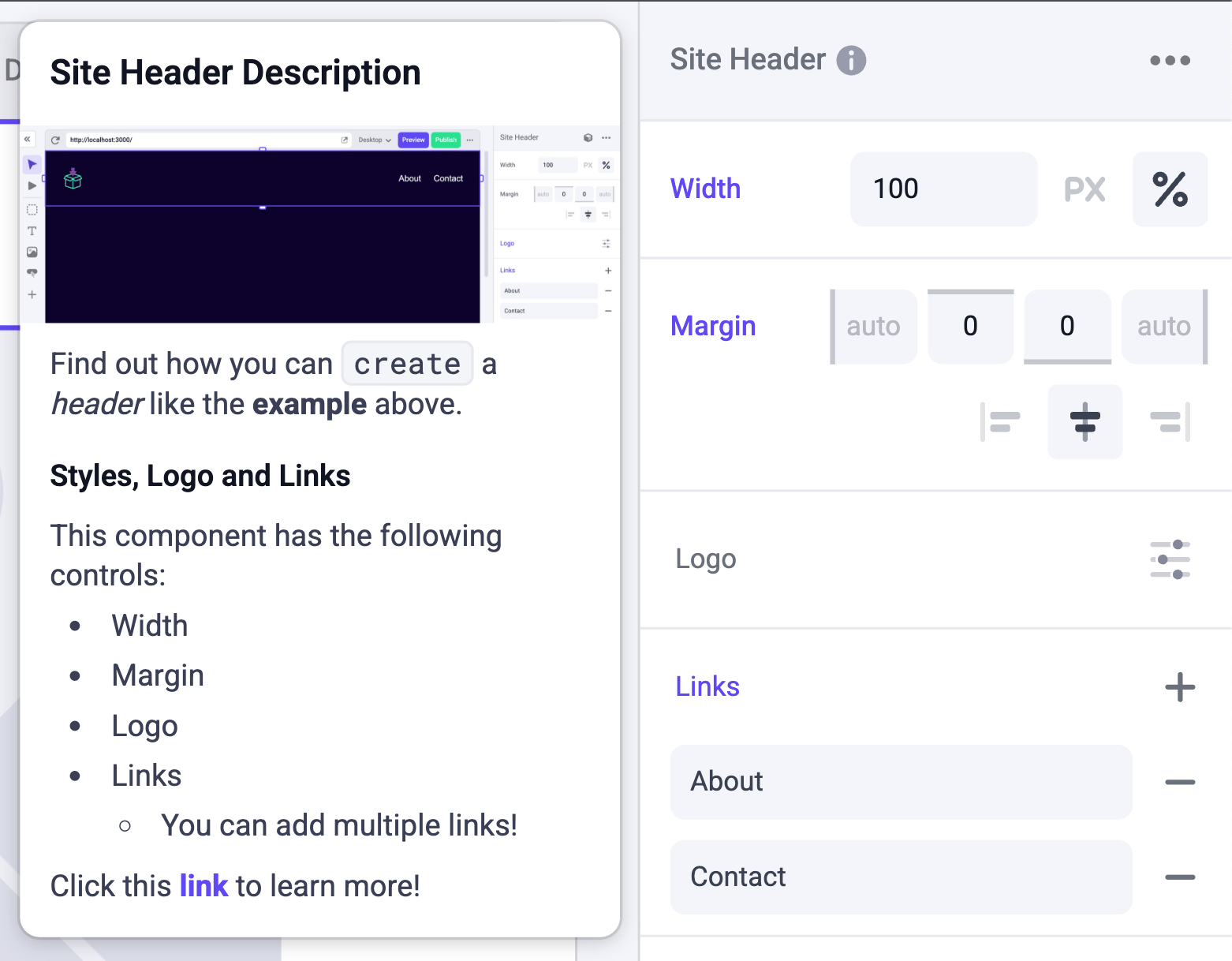
We can define a description string using markdown formatting, and then in this `layout.tsx’ we can add the description field.@/app/layout.tsx