
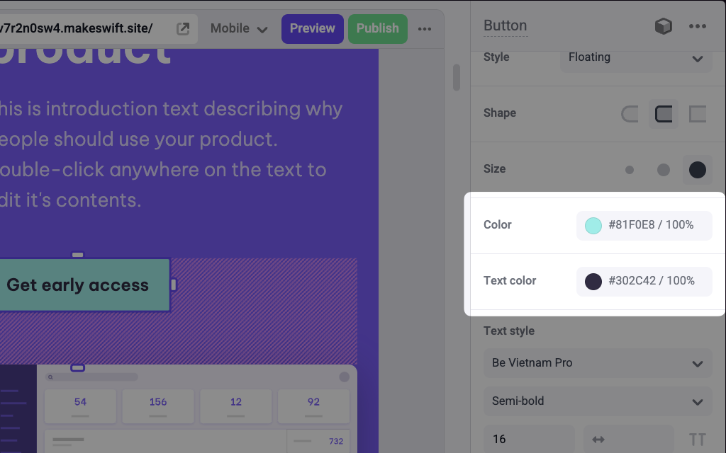
Color panels on a Button component to edit the background and text colors
Params
string
default:"Text"
Text for the panel label in the Makeswift builder.
string
The description shown in the Panel of the Makeswift builder. This can be written in Markdown format.
Added in
v0.24.8."vertical" | "horizontal"
default:"horizontal"
Position for the color label within the panel.
string
The value passed to your component when nothing is set in the Makeswift
builder. Must be a valid CSS color string.
boolean
default:false
Indicates whether to hide the alpha channel slider.
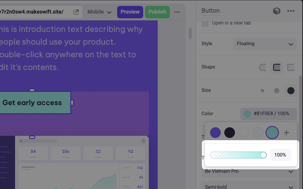
What is the alpha channel slider?
What is the alpha channel slider?
Prop type
The Color control passes astring RGBA value to your component. If you don’t set a defaultValue and no value is set in the builder, your component will receive undefined.
Example
The following examples adds two Color controls to thebackgroundColor and color props of a Button component.
Using inline styles
Using CSS variables
.makeswift.ts is a naming convention for organizing Makeswift registration
code. Learn
more.